After more than 24 hours of traveling, I’m finally home. Stepping off the plane at Chiang Kai Shek Int’l Airport in Taiwan, a far ways off from Duke University’s North Carolina campus, I whip out my iPhone. I hit settings -> Wi-Fi -> ON. Immediately I’m greeted by a plethora of free public wi-fi access points. Open Google Currents, and I get updates to Engadget, Gizmodo, Sci-Am, and all the other mainstream news sites I’ve been deprived of for the past 24 hours.
Loading… 1/4 Done… 1/2 Done … Loading… Loading… Any time now…
The connection hangs for more than 10 seconds - well beyond the average tech savvy person’s attention span. Annoyed, I force quit the app and pray my second connection attempt has better luck, and … win, it does. With higher traffic on public wifi on a normal day in Taiwan, one might not be as lucky as I was. Living in Taipei, I have had the opportunity to visit numerous countries in East Asia, all with advanced wireless network infrastructure. Some big cities like Taipei, Beijing, and Singapore have government sponsored free public wireless more or less all throughout the city, but the wireless infrastructure is nowhere nearly designed to handle large public loads – as such wifi becomes slower than 3G in crowded areas. Other places such as Hong Kong, Tokyo, London, and Belgium do not have prevalent free wifi, and, like in the US, most people rely on just 3G, which unfortunately has a bandwidth that doesn’t really cut it either. There are also countries that have limited or non-existent 3G infrastructures, which makes mobile browsing even more difficult on the go.
When I reach home, I settle into my comfy bed, phone in hand. Happy to finally be connected to fast WiFi and not having to deal with deathly slow loading times, I open up a website I browse a lot while in the US… loading…. loading…. laaaaaaaaaaggggg….. done. Wow that took a long time. Look at how much data its loading…no wonder it was taking so long.
Unfortunately, this is an all too common scenario for countless internationals trying to access United States-based mobile sites from outside the US. The experience is just always sub par. Many websites, in their quests for world domination, forget to optimize for the rest of the world!
Luckily, The Chronicle’s mobile site is not one of them. Duke University’s student body is 13% international, and so we make it a priority that the more than 1 in 10 students at Duke who try to view our site from a mobile device from outside the US have a pleasant experience. According to Google Analytics, The Chronicle website gets 4.4M pageviews a year, with 1 in 8 views from a mobile device. 8% of all views are from outside the United States. This amounts to 352,000 pageviews a year from outside the US and almost 600,000 on mobile devices, a significant number representing an audience that we cannot simply ignore as site developers. Thus, we have to create the best experience for the market outside the United States, including those that prefers to view our site on the go. But maintaining an internationally-optimized mobile website is not an easy task, and good engineering practices on the front and back end are paramount to sustaining a good mobile version.
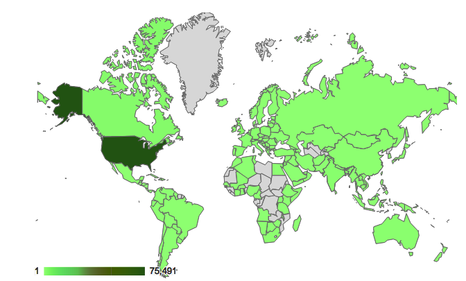
Graphic: Map visualization of the number of visits to dukechronicle.com
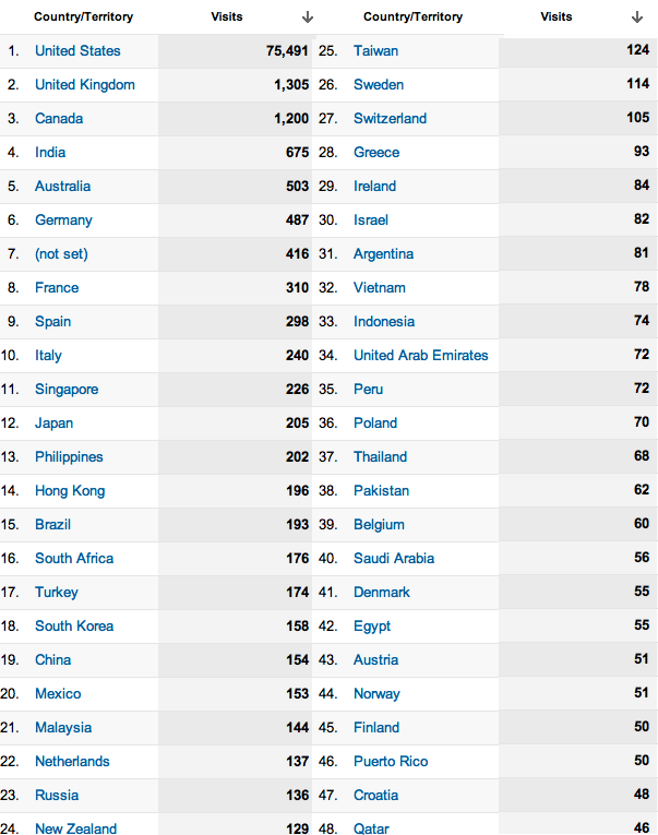
Figure: Number of visits to dukechronicle.com by country
When I talk about “mobile”, the scope is not restricted to smartphones - tablets and netbooks have also gained in popularity - perhaps a better descriptor would be “non-traditional computers”. Due to varying resolutions, operating systems, touch capabilities, connection speeds, and processing power of devices nowadays, we’re starting to see a little repeat in history – developers are encountering the same problems as back when LCD monitors revolutionized computer displays, when desktop resolutions increased. Remember when we used to see “This site is best viewed in 800 x 600 resolution” on web pages? Now we’re seeing “This site is best viewed with iPhone”. On top of that, the physical distance between the United States and the rest of the world induces a higher latency for each packet, some countries have government-imposed firewalls that throttles transmissions, and many countries’ wireless traffic density is much larger than that of the United States. Put that all together and it means some sites should also be saying “This site is best viewed from the United States!”
Obviously, this is not how mobile should be done. A recent survey found that 57% of mobile web users had a problem in the past year when accessing a website [1]. It also found that 46% of mobile web users are unlikely to return to a website that they had trouble accessing from their phone, and 57 percent are unlikely to recommend the site to others. In addition, 34% said they’d likely visit a competitor’s mobile website instead. Simply put, you will lose users if you don’t provide them a great mobile experience. And if they’re outside the United States, it will be harder to provide them a great mobile experience.
Today I’ll be discussing good practices for international-optimized mobile web development, and how Chronline has approached the many issues surrounding mobile. Even if you are not trying to make your site optimized for the whole world, all these guidelines still apply to mobile sites in general, even if they are more important outside of the United States. There’s a few obvious guidelines every mobile site should follow, even if the correct implementation for them isn’t all that obvious. In terms of the guidelines, mobile websites should:
Minimize data transfer.
It is undisputed that the cost of wireless transmission is extremely high nowadays. High packet loss and bad connections result in slow page loads and higher device power consumption, due to TCP standard retransmit and waiting. Both of these things users HATE with a passion. In fact, a survey from market research group TNS of 7,000 mobile users in 15 countries (not just the United States!) found that over 75% of people placed better battery life as the main feature they want from a future smartphone [2]. Another survey found that 71% of users expect websites to load as quickly or faster on their mobile phone compared to the computer they use at home [1]. Now think about that. If your website that users see from their mobile device is bloated and takes 5 seconds to download even with good 3G connection, you’re going to have some unhappy campers. And if it takes 5 seconds to load in the US, it’ll take double that outside the US.
Load quickly.
Mobile users are most likely on the go, and the last thing that they would want is to wait for Windows 7 to boot. It would be wise for your site to be slightly faster than that. While this is similar to the minimize data transfer guideline, it is independently important as well. The data that is sent to the mobile device might be small, but if the source code renders a 3D environment in WebGL behind the scenes, your site might suffer from limited viewership. In addition, if you expect your site to be used all over the world, you should expect to geolocate your content all over the world.
Functionally similar to the regular site.
For Chronline mobile, the last thing we want a user to say is, “I could read about derp on the regular site, but how do I on mobile?” Lack of functionality discourages the use of the mobile version, and most people would rather save themselves the trouble. Users only have so much time when they’re on the go, and they will choose to look at the sites most functional as compared to their non-mobile counterparts. Make sure you’re one of those sites.
Opt out.
A lot of times minimizing data transfer means minimizing site design and/or functionality. Some people just might not be able to handle minimalist sites for one reason or another, or might want to use some discrete functionality only on your regular site. Let them opt-out at their own volition and view the regular site from their mobile device. Don’t force the hand that feeds you.
Design with every type of mobile device in mind
As with a regular website, your site should look and function great on different screen sizes, resolutions, browsers, and operating systems. And if you want a “worldly” mobile site, include operating systems popular in other parts of the world in that assessment, like Symbian and Bada.
With these guidelines in mind, let’s take a look at the network footprint of http://www.dukechronicle.com/m/. I pulled up Chrome Dev tools starting from a cold cache, and in Figure 1, we see that the front page of the mobile site downloads only 100kb of compressed data – nice and quick. JQuery and JQuery Mobile libraries (which I’ll talk about more later) take up 60kb, the site’s css sheets takes up about 12kb, and our own mobile javascript files take up 19kb. The ajax request that loads the actual content of the homepage is 3kb, which fits comfortably into one IP packet. You might think, “well duh, all you have is text, what about thumbnails?” We considered the pros and cons of having thumbnails with each list item. At the end of the day, we are looking to reduce data transfer, and thumbnails would quickly rack up bandwidth. Would thumbnails make the site more appealing? Given the resolutions and sizes of smartphone screens, would users even be able to see the image clearly enough to have it be worthwhile? Are they going to read or not read an article based on the tiny image associated with it? We thought no, but obviously you can weigh in your own opinion here.
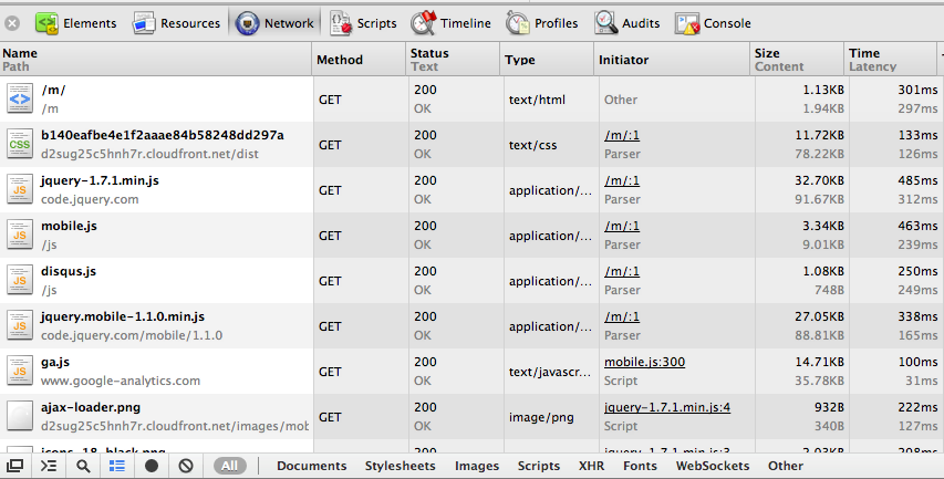
Figure 1: Chrome Dev tools analysis of dukechronicle.com/m/ - part 1
Looking at Figure 2, from the moment I hit enter on the address bar, it takes approximately 2 seconds for the site to fully load in Taiwan. On an actual 3G benchmark from the US, loading takes approximately the same time. These numbers clearly decrease with caching of JQuery, JQuery mobile, and our site’s mobile javascript and css, which account for most of the data transfer. Moreover, page transitions are smooth - once again, articles take about 2 seconds to load on average. One might think of ways to reduce page loading ti mes, and the first idea that pops into mind is prefetching. However, before you happily code away, let us be reminded of the first good practice - minimizing data transfer. Using similar logic from before, one would more or less conclude that prefetching data to smoothen user experience is unfeasible.
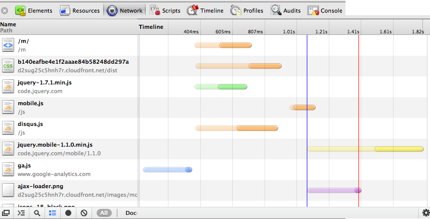
Figure 2: Chrome Dev tools analysis of dukechronicle.com/m/ - part 2
At the same time, we must not forget that JS and CSS are cached on mobile. This reduces the load times even more. When the cache is warmed, the main page and article pages now load in just over a second in Taiwan. Just to compare another benchmark, on wifi in the US, the mobile site loads in approximately 800ms cold cache, and even less than that cached.
Finally, Chronline mobile has organized subsections similar to that of the original site, a search bar for any specific searches, and finally, the almighty op-out button on the bottom right corner, which Balrog, “you shall not press!”

Figure 3: dukechronicle.com/m/
So how do we maintain versions of the mobile site to support all the different mobile platforms? The trigger happy developer might immediately jump into hardcoding cases for each type of mobile device, but asides from that being bad coding practice, it’s also quite a pain to have to test all those different Android models and such (yay fragmentation!). Which calls for a layer of abstraction… Enter: JQuery Mobile.
JQuery Mobile (JQM) is a cross-platform web framework that supports virtually any smartphone use case seamlessly. Its syntax is extremely clean (you’re writing minimal HTML) - just by giving tags certain attributes, JQuery Mobile instructs the mobile browser to render the window to the developer’s specifications. From what I’ve witnessed, it works beautifully on both Android and iPhone, and it claims to support much, much more. JQM comes with a whole bunch of presets that a web developer would want - lists, buttons, forms, toolbars…etc. If you don’t like the default themes? Slap on a custom style sheet and you’re done. Just like that, the first iteration of Chron Mobile was made in a single hour, and it worked on every mobile OS.
So what does JQM mean for mobile web dev? If all mobile sites were to use JQM, mobile users will not have to download each site’s ginormous custom JS file because lots of mobile sites would all share the same javascript (read: smaller data transfer). For the user, pages will be clean, accessible, and more or less display-glitch free. Smaller pages mean higher portability, increasing the chances that a page would load fully in low connectivity areas. For the developer, easy learning curve, and countless hours saved from having to deal with cross platform display issues. JQM protects us from reliving another IE 6/7 compatibility nightmare, this time in terms of mobile.
Of course, at the end of a day, Chronline Mobile is nowhere near perfect, and there’s much more we can work on to optimize the site. For example, from the benchmarks I did from Taiwan, my user experience is 3 times slower than in the US. Just by physical separation distance, the speed of light imposes an unavoidable 100ms ping between Taiwan and US servers (almost halfway around the world). However, if we use a content delivery network such as Amazon CloudFront to geolocate our static content, the many Duke students and Duke fans in all corners of the world can access our mobile site almost as quickly as those in the US. We recently packaged our mobile CSS files to do this, and have seen a whopping 33% reduction in overall load times in Taiwan, and an 11% reduction in the United States, due to faster CSS download (Figure 4 shows before CDN in Taiwan). We still need to do this with our mobile javascript, however, but jQuery hosts JQuery and jQuery Mobile on their own CDNs, so they experience geolocation benefits. We should also take this a step further and combine our various mobile Javascript files, to minimize the number of HTTP requests (for speed and battery life benefits) the mobile phone has to make to view our site.
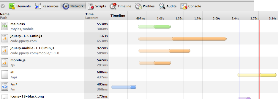
Figure 4: Latency from Taiwan pre-CDN
In summary, when developing for the internationally-optimized mobile web, one cannot think in terms of traditional websites. One must remember that mobile devices have limited processing power and screen space, and more importantly, expensive network transactions. And users outside the United States have a whole bunch of other network-related issues to deal with. Mobile phones and the global web have certain limitations, and we must develop with those limitations in mind in order to provide the best experience possible.
Sources
- http://www.gomez.com/resources/whitepapers/survey-report-what-users-want-from-mobile/
- http://www.informationweek.com/news/171100095
Update: Since the writing of this post, the design and implementation of the Chronicle’s mobile site has changed. It is currently live at http://m.dukechronicle.com.